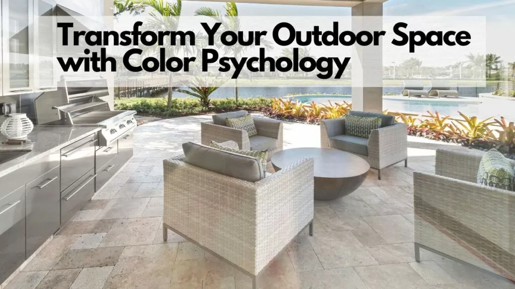
Did you know…
… How you decorate the outside of your home can say a lot about you?
The accessories you choose, the colors you use, the way you adorn it (or not!) with textural and natural elements… it all can be a reflection of how you choose to present yourself and your personality to the world. But have you ever considered that what you choose to surround yourself with could also affect your mental health and well-being?
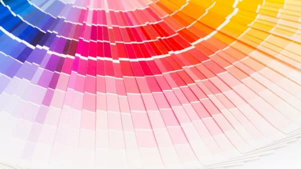
Color psychology is an interesting concept exploring how our personalized experiences with hues can influence our behavior and daily life. As Spring is approaching, now is the perfect time to think about how to use color psychology to transform your backyard space into an oasis. Let us explore how you can do just that. From selecting a strong color accent wall to creating a vibrant garden, find out how to use color psychology to craft an outdoor space you’ll never want to leave.
The Psychological Effect of Color
Color has long been used to evoke a certain emotion in people and carry out specific messages. Throughout history, colors have represented different ideas and been closely tied to religious organizations, nations and more. In a more modern sense, colors still hold great power when it comes to creating a visual aesthetic and associated emotional response. Color psychology is the study of how colors influence our perception, emotions, and behavior.
Generally lighter colors represent serenity and peace, such as shades of white and light blue. Warmer colors, like reds and oranges, can often evoke feelings of energy, aggression and passion. Cooler colors like greens and blues may evoke feelings of calmness or relaxation. While some believe that certain colors can cause a specific emotion in everyone who views them, others disagree and point to culture as the better explanation for the impact color holds on our emotions. People in different cultures may experience the same color differently. For example, red is seen as a symbol of luck in China, while it might be seen as aggressive in western culture. Despite this debate, however, most people respond similarly to broad color groups: warm tones bring energy while cool tones create tranquility.
By understanding the psychological effects of color on people’s emotions and behavior it’s easy to incorporate this theory into outdoor space design. These concepts can help create an oasis where the space feels inviting with just the right balance between peacefulness and energy depending on how bright or muted the shade chosen is.
Color’s Impact On Emotions

Color has a powerful influence on emotions, often evoking both positive and negative responses. Research suggests that the various colors we see in our environment can affect how we feel, or our mood. For example, a study conducted by Debra Orange found that people tend to be more relaxed in green or blue environments. The reason for this is because these colors create a sense of natural harmony and evoke feelings of serenity. On the other hand, orange and yellow are stimulating colors that elicit feelings of happiness, warmth, and energetic vibrancy. Since this is the case, it’s important to consider which color combinations you choose when transforming your outdoor space. A vibrant combination of oranges and yellows may result in an uplifting patio area while shades of blue may create a more peaceful and calming atmosphere.
The impact of color on emotions is undeniable; however, it’s important to bear in mind that individual reactions to color can vary greatly depending on personal experience and culture. It’s also possible for previously neutral colors such as white or grey to become significant depending on their context. Thus, it’s essential to thoroughly plan out any color scheme you choose for your outdoor space according to your desired ambiance and taking into account any pre-existing features.
The Influence of Color on Mood
The influence of color on mood is a topic that has been actively studied by psychologists, interior designers, and fashion experts. Although there is no definitive answer as to how certain colors may directly affect your mood, some general trends and emotions are associated with different shades of color. Research by Kendra Cherry, The Psychological Effects of Color, suggests that the use of color can both positively and negatively affect our psychological states.
For example, reds and oranges are traditionally considered energetic and stimulating hues that increase feelings of warmth and dominance. It is believed that when exposed to these shades, people tend to feel more enthusiastic, alert, confident and determined. Blues and greens are generally thought to be calming colors linked to peace and tranquility. These tones are said to promote relaxation, productivity, mental clarity and focus.
Purples, another popular hue for outdoor spaces, often inspire creativity and spirituality due to its association with mystery, extravagance, wisdom and ambition. Yellows typically symbolize hope, joy and optimism although too much exposure could cause anxiety or depression in some cases . Importantly, neutrals such as black , white, beige or brown may help create a sense of serenity through their minimalist appeal but overuse of these colors can also lead to dullness and boredom.
When considering the influence of color on mood one must consider how various shades interact together to create subtle nuances within your outdoor design scheme. While one shade may set one tone, two or three different colors combined can produce an entirely different atmosphere. Balance is key to creating an ideal oasis in your outdoor space.
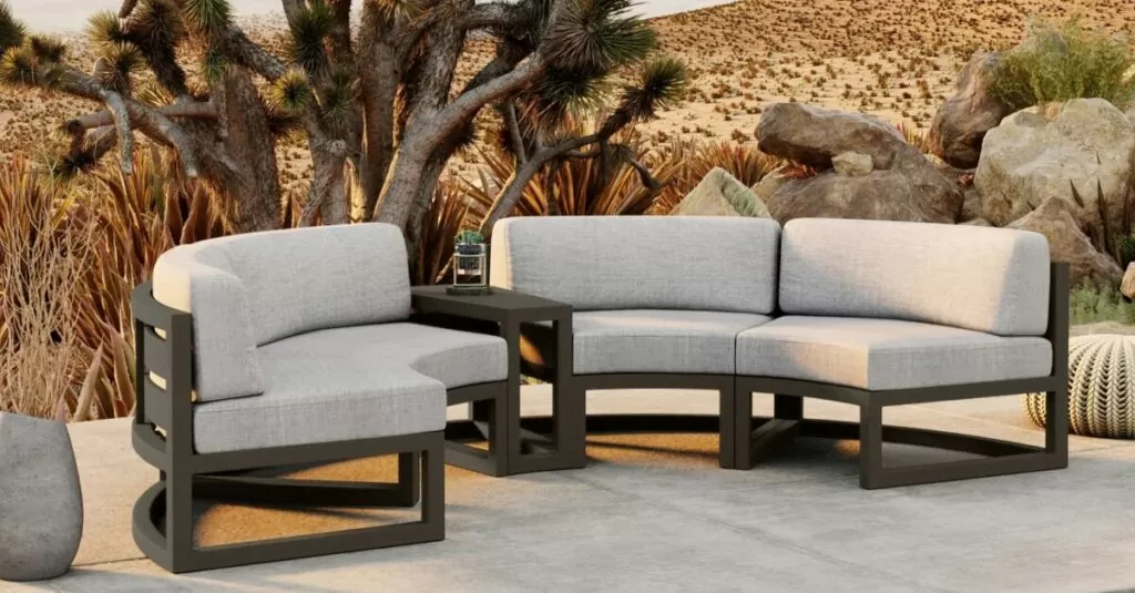
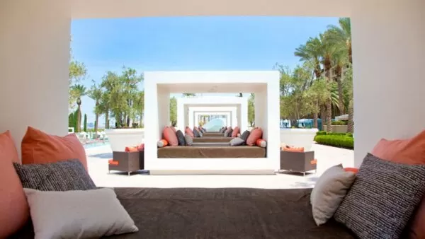
Creating Your Colorful Outdoor Oasis
Creating your colorful outdoor oasis is not as difficult as you may think, so don’t be intimidated by the endeavor. Start by determining what purpose you want your space to serve. Do you want an entertaining environment for hosting guests or a relaxing place to spend quality time with family? Whatever the intention, use that knowledge to determine which color palette best suits your needs.
If the goal is entertainment and socialization, stick with brighter, energizing colors like pinks, blues, or oranges. These shades create a vibrant environment and can help induce conversations amongst your guests. On the other hand, if the focus is relaxation and tranquility, try softer hues such as greens, yellows, and lavenders. These calming shades will add instant serenity to your outdoor area.
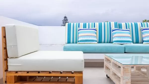
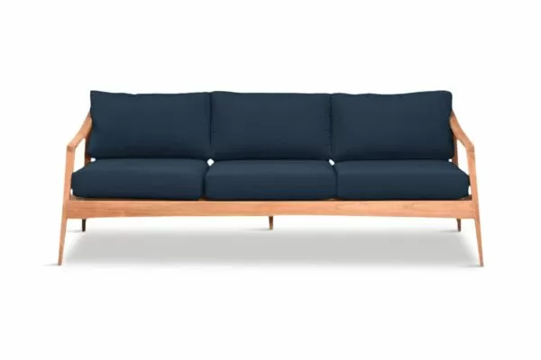
It’s important to remember that different color combinations produce unique psychological effects on our psyche as well as trigger varying sensory experiences. Take time to experiment with various color schemes until you find one that works best for your space. Additionally, look into materials when designing your outdoor oasis. For example, teak furniture combined with a navy-blue colored awning can create a luxurious seaside atmosphere — perfect for enjoying those beautiful breezy days.
At the same time, don’t underestimate the importance of adding personal touches like photos, artwork, or special trinkets to truly make it “your” outdoor living area. Use these elements in combination with color psychology to create an atmosphere that fits your own style and personality.
Plants and Decor
Plants and decor create the final touches in transforming an outdoor space into a tranquil oasis. Adding texture, life, and comfort to any environment, plants and decor can evoke a sensation of peace and serenity. Choose greenery such as succulents, ferns and grasses with bright pops of floral hues, as well as earthy tones like green, yellow and blue. Decorative items can be used to soften the space with ornamental pots filled with plants on walls, floors or tables.
When selecting outdoor furniture, think natural materials like wood or water-resistant fabric to add a breathing element to the area. Comfortable furnishings should also be considered to invite people to relax together in their new outdoor space. Incorporating soft fabrics like pillows, throws and rugs can provide more warmth and visual attractiveness.
The perfect balance between plants and decor must be weighed carefully for a cohesive design experience; too much greenery will make the space appear too sparse while overcrowding it with knickknacks will look cluttered. The options are endless for creating an inviting outdoor setting with color psychology but finding that delicate balance is essential for creating your own personal oasis.
Environmental shades and colors form an important part of the overall ambience created by color psychology in an outdoor living space. Combining these colors effectively allows the space to capture all its elements while maintaining its purpose as an inviting escape from reality.
Environmental Shades and Colors
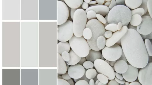
It's not just plants and decor that affect the final look of an outdoor living space, and emphasize or understate the colors you choose. You need to think about how your environment will affect shades and colors in your backyard as well. Completely natural factors beyond your control, such as sun exposure and moisture levels, can help to determine which shades and colors will work best in your patio or garden. But also, some natural factors within your control - how much plant life you have, the ratio of lawnscape to hardscape, whether or not you have standing water like a pond or pool in your yard - all play a part. It's important to consider the emotional impact that certain shades and colors - in combination with the environment - have on people in order to truly create the perfectly tranquil and peaceful patio of your dreams.

Have ample sunlight pouring in to your outdoor living space? Light beiges and pastels are often recommended to create a more mellow, calming atmosphere. These shades will help to reflect the light and amplify or saturate the other colors in your garden without becoming too bright or visually overwhelming. But too much off-white, like beige or bone, can be a bit too saturated. To balance out overly-strong light levels, consider warm earth tones such as dark browns and oranges. These darker hues provide contrast while still giving off an inviting feeling - going too dark can be a bit oppressive, making your space feel smaller and more boxed in.

On the other hand, if you have a darker outdoor area that receives comparatively limited sunlight, cool blues and greens can help to add a sense of organic brightness. These cooler hues can help balance out any natural shadows that may be present in your outdoor space. These cool colors work with your shadows, rather than against them, for a more restful, perhaps even sleepy (in a good way!) look on your patio.

No matter what type of environment you have, when it's time to color your outdoor space you'll want to find a shade or color palette that works for both the physical (read, "natural") and psychological (read, "emotional") aspects of the area. Choosing the right combination of shades and colors can make all the difference when creating a tranquil, natural space for you and your friends and loved ones.
Most Important Highlights
When designing the shades and colors of an outdoor space, it is important to take into account both environmental factors (sun exposure, moisture levels) and how certain hues can create a calming or inviting atmosphere. For sunny areas, light beiges and pastels work well to reflect light without becoming too bright and warm earth tones such as dark browns and oranges provide contrast. In darker areas with limited sunlight, cool blues and greens add brightness. Ultimately, the right combination of shades and colors can create a tranquil oasis for all who enjoy it. Lastly, vibrant colors bring life to any outdoor area.
Focusing On Vibrant Colors
Adding vibrant colors to your outdoor space is a great way to inject energy and create a bold, lively ambiance. Vibrant hues can be used in moderation to bring life to any garden scene and can range from the warm tones of peaches and pinks to brighter shades of yellow and blue. As with any design element, you need to be aware that vibrant hues will attract attention and should be used sparingly. While their positive effects can create stunning visual impact, if overdone they might overwhelm or detract from the overall look and feel.
For example, bright oranges and intense purples can give your outdoor space an immediate boost in life, but if you go overboard with multiple shades it could result in an overloaded look that nobody wants. Instead, consider adding pops of color here and there by adding flowers, planters or accessories in these shades – this will make all the difference in transforming your outdoor space. Additionally, lighter and more subtle shades of these colors can introduce a sense of serenity or peace for an atmosphere for restful gathering.
Furthermore, it’s important to understand how color psychology affects us as well as how it accompanies other outdoor elements such as furniture, plants and landscaping features. It’s also worth noting that matching certain colors together – like green with blue – may evoke a sense of balance while a clash of too many colors at once can create tension. To ensure you get the desired outcome, consider experimenting with swatches to help you decide which color combinations work best together and provide the look you want while avoiding sensory overload.
Creative Strategies For Applying Color
When it comes to transforming an outdoor space, creative strategies for incorporating color are a must. By understanding and applying the principles of color psychology—such as choosing colors that soothe and inspire—any outdoor space can be transformed into an oasis of relaxation and/or purpose.
Color selection should be based on individual preference, with some factors being more important than others. For example, the use of warm-toned colors (such as reds, oranges, and yellows) can create an energizing atmosphere, while cool tones (blues, greens, and purples) can lend a calming effect. Whether to opt for bold or muted colors is often a matter of personal preference; some might find the vibrant hues of coral or turquoise to be inviting while others may prefer subtler shades like mauve or sage. Whatever option is chosen, both can achieve a variety of goals: one choice might signify vibrancy and passion while another may evoke serenity and relaxation.
Another strategy to consider when choosing colors is context. Earthy tones such as rust and taupe might best suit a rural landscape with wooden furniture, for instance, but could end up feeling jarring when compared to the blues of an oceanside view. On the other hand, brighter colors such as yellow and green can add a cheerful touch to any setting. Bright colors also serve to draw attention to specific features in the landscape while maintaining a backdrop of harmony throughout the entire space. The best way to harmonize with nature is by using natural color palettes and soft tones that blend in perfectly with your environment.
Paint Choices For An Outdoor Atmosphere
When it comes to paint choices for an outdoor atmosphere, there are several considerations to bear in mind. On the one hand, bright and bold colors can be used to invigorate a space and create a sense of fun, hospitality and vibrancy. Using dramatic hues such as reds or oranges can instantly draw the eye and energize an area with color. The use of warm tones like oranges and yellows also signals comfort and coziness, making it easier for people to relax in their outdoor oasis.
On the other hand, calmer shades like blues, greens and neutrals can be used to create a more serene environment. Shades of blue often evoke feelings of tranquility while greens bring forth a sense of nature and well-being. Neutral colors like tans and whites provide a calming palette that is also ideal for entertaining guests since it won’t overpower the natural elements of the area.
Once you’ve made your choice of color palette for your outdoor space, you’ll need to consider the type of paint finish you intend on using. Matte finishes can create a softer look while glossier paints reflect light more dramatically. In either case, you should make sure to carefully select a durable paint that can withstand exposure to sun, rain, wind, and other weather conditions if you want your color scheme to last.
With the right combination of colors, your outdoor space can be transformed into a vibrant space or a calming oasis depending on what suits your needs best. Before you make any decisions though, it’s important that you take the time to research how different colors affect moods and behaviors so that you can choose wisely and make sure your outdoor space provides just what you’re looking for.
Final Thoughts on Creating An Outdoor Oasis With Color Psychology
Colors have an incredible and irreplaceable impact on how we experience our environment and interact with the world. Colors do more than just help us make sense of what our eyes are seeing - they actually have a direct impact on our moods and thoughts, making us feel a certain way. When applied with thought and purpose in outdoor spaces, color is a powerful tool in your design arsenal that will turn your backyard into a haven of relaxation and comfort - and, yes, fun!

The use of color psychology to design an outdoor space offers a unique opportunity to make a remarkable statement without having to resort to any additional costly or overly-elaborate decorations. We all have that one friend, right? The one who goes a bit too hard on the decor-spew... Well, introduce them to color psychology instead. Color will alter how they perceive their environment and themselves in it. Used wisely, the benefits of applied color psychology are immeasurable.

Since color preferences can vary pretty widely person to person, you should also consider incorporating different colors into the space. And not just "different colors," but different color types. Neutral tones like white and gray can act as a foundation for adding bright splashes of primary colors to draw attention, or to provide stark contrast with shadows. Cool colors accentuate shade and create a more idyllic vibe, and warm colors make a place feel cozier. By mixing textures, materials, and hues, the different elements will be interrelated well while still providing aesthetic interest - i.e., the "look." Because at the end of the day, color psychology is amazing, but we really want our outdoor entertaining spaces to look good, right? Creating an outdoor living destination with color psychology in mind may be seen as a way to create more pleasant experiences in the outdoors, or simply as a method of effective decoration.

One last warning though, before you head out on your color adventure. Although there are many benefits to using color psychology when designing an outdoor space, it is important to remember that it should not serve as a substitute for proper construction techniques and maintenance practices - as they say, safety first! Proper preparation of the soil for landscaping and installation of outdoor structures such as sheds and decks must come first before considering any design ideas. Make sure your platforms and seating options, from furniture to ledges and retaining walls, are properly built and made to last. With a rock solid foundation of safety and comfort, you can begin experimenting with colors to truly make the space unique.

By combining thoughtful planning and thoughtful use of color, anyone can have the opportunity to transform their outdoor space from something mundane into something utterly beautiful. Careful consideration of current needs and future plans will help ensure long-term enjoyment of the space. Besides enhancing the aesthetic appeal and suggesting feelings of serenity , investing in such renovations increases home value too — making it well worth the effort.

Oh, and one last thing?

Have fun!
Article references:
Orange, D., & Leavy, D., (2018). Color Psychology – What are the Effects of Different Color? Fuller View Consulting.
Sharma, M., Color Psychology – How Colors Impact Our Moods And Behaviors?
Azrieli Centre: Colour Theory Explained
Ostroff, J., (2017). Why Context Is More Important Than Color When Communicating Emotions? The New York Times

Todd is a co-owner of Patio Productions and has worked extensively in the furniture industry since 2002, when he started a company that designed and manufactured bathroom vanities. He now has a hand in all online business operations, including keeping tabs on industry trends and making sure Patio Productions remains an innovative leader in the outdoor furniture space. He lives just outside of Denver, Colorado with his wife, two boys, and two dogs. They live on a lake where they can make the most of the outdoor lifestyle. His favorite patio furniture sets are his Harmonia Living sectionals.